Contest

JaleneStradling_P11

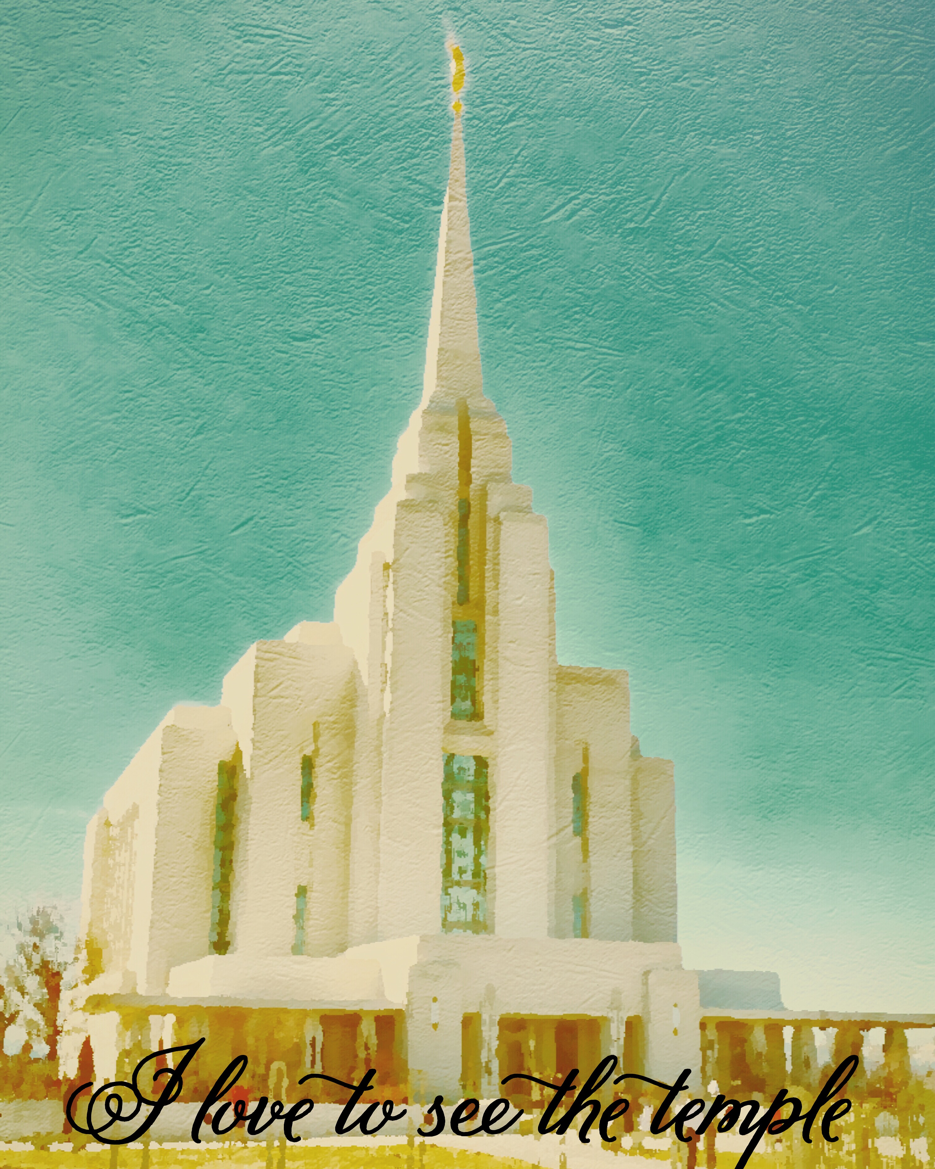
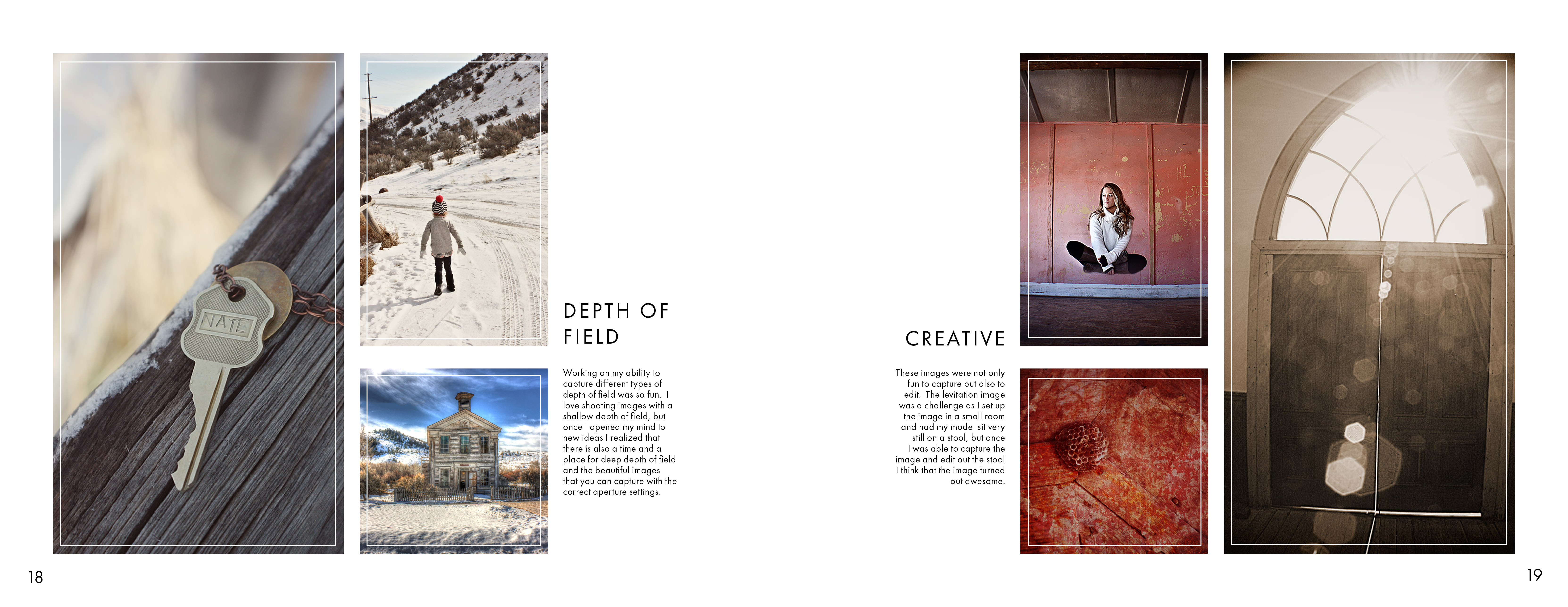
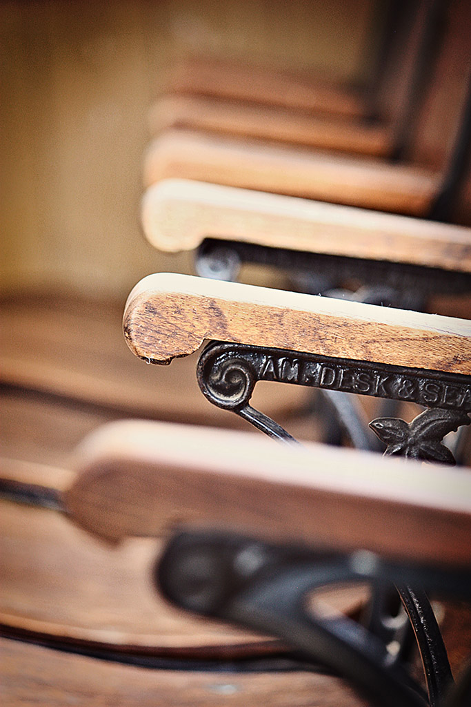
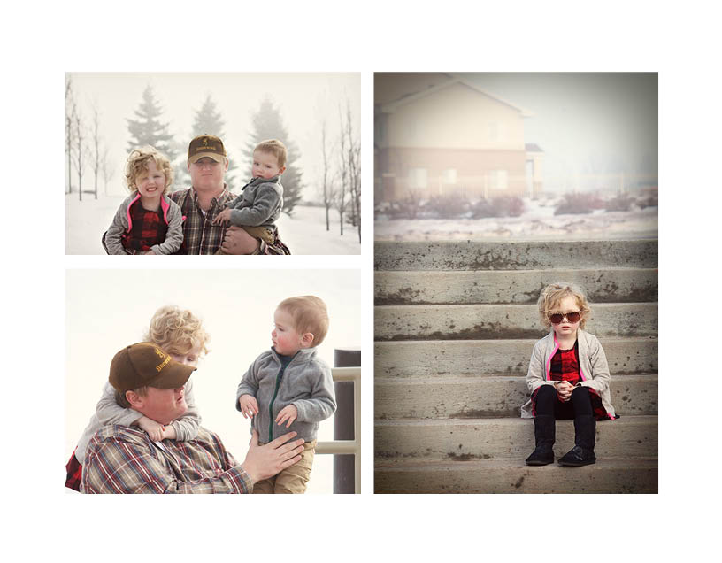
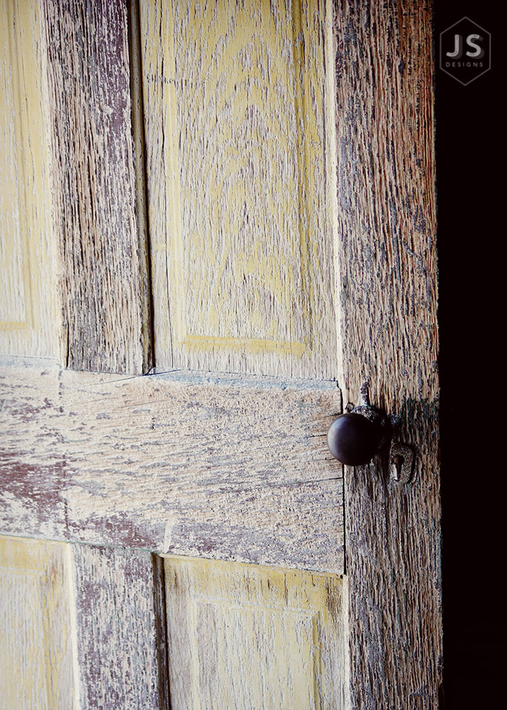
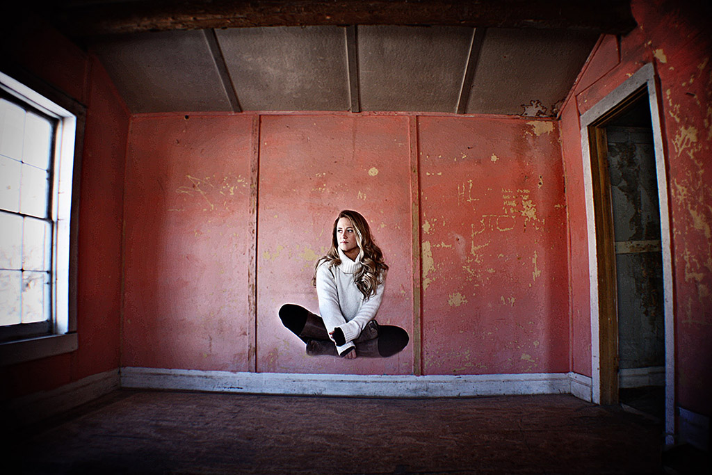
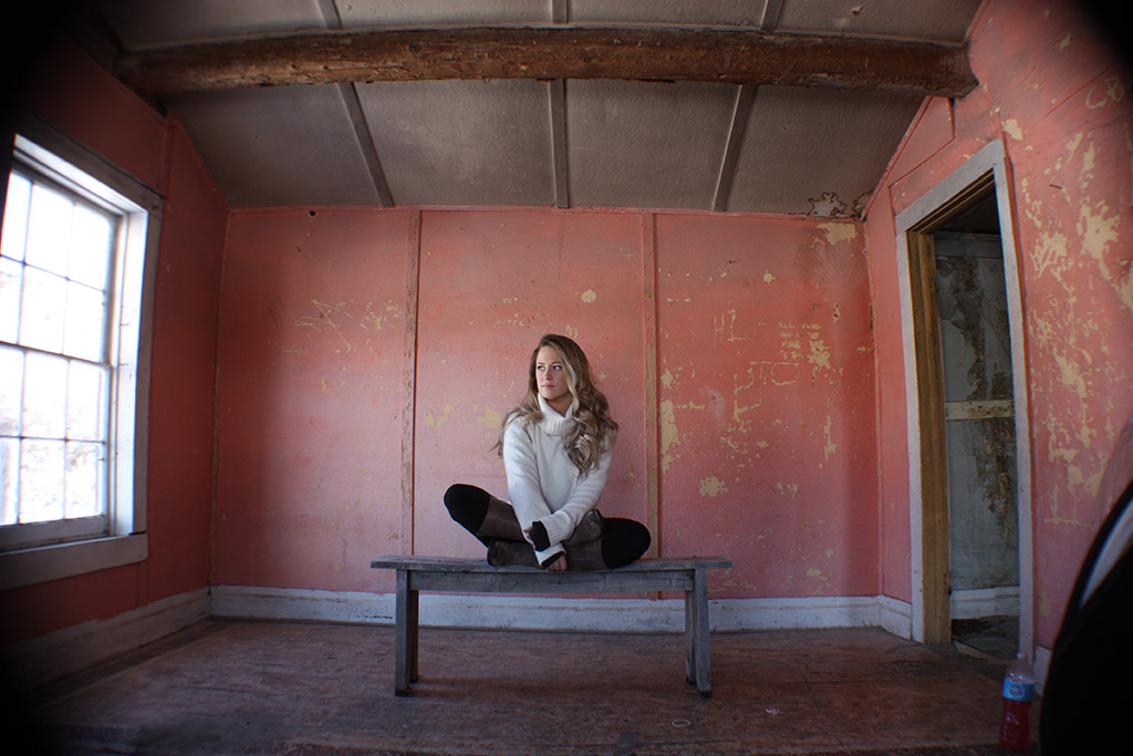
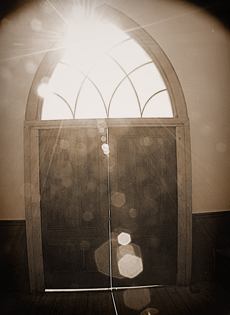
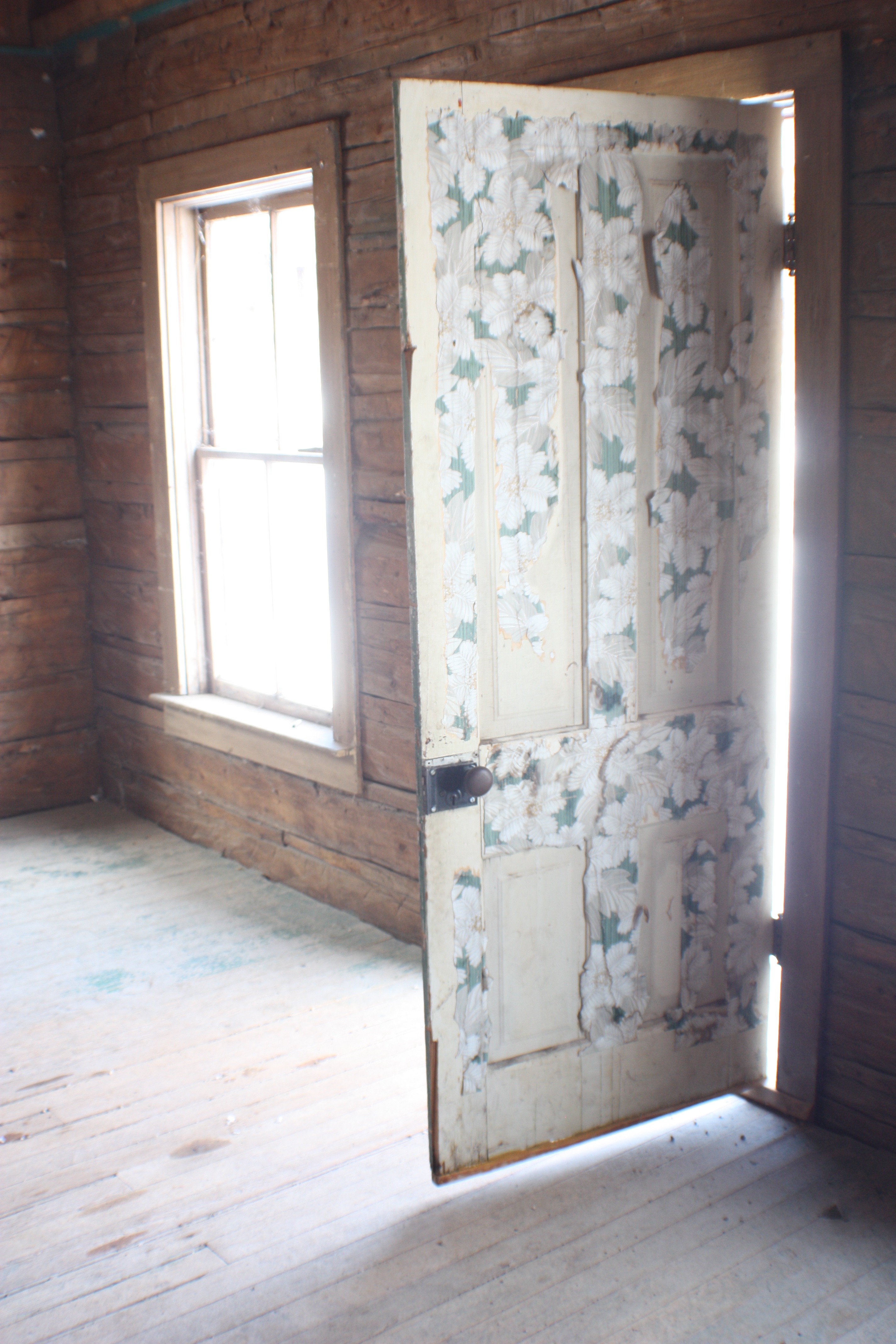
For this contest I entered the visual society’s first cash contest which was also a print contest.  I had just finished this perspective of 12 assignment right before and loved how the color in this image turned out and wanted to use this picture as my print.  I love how it turned out and how it used just a monochromatic color scheme.

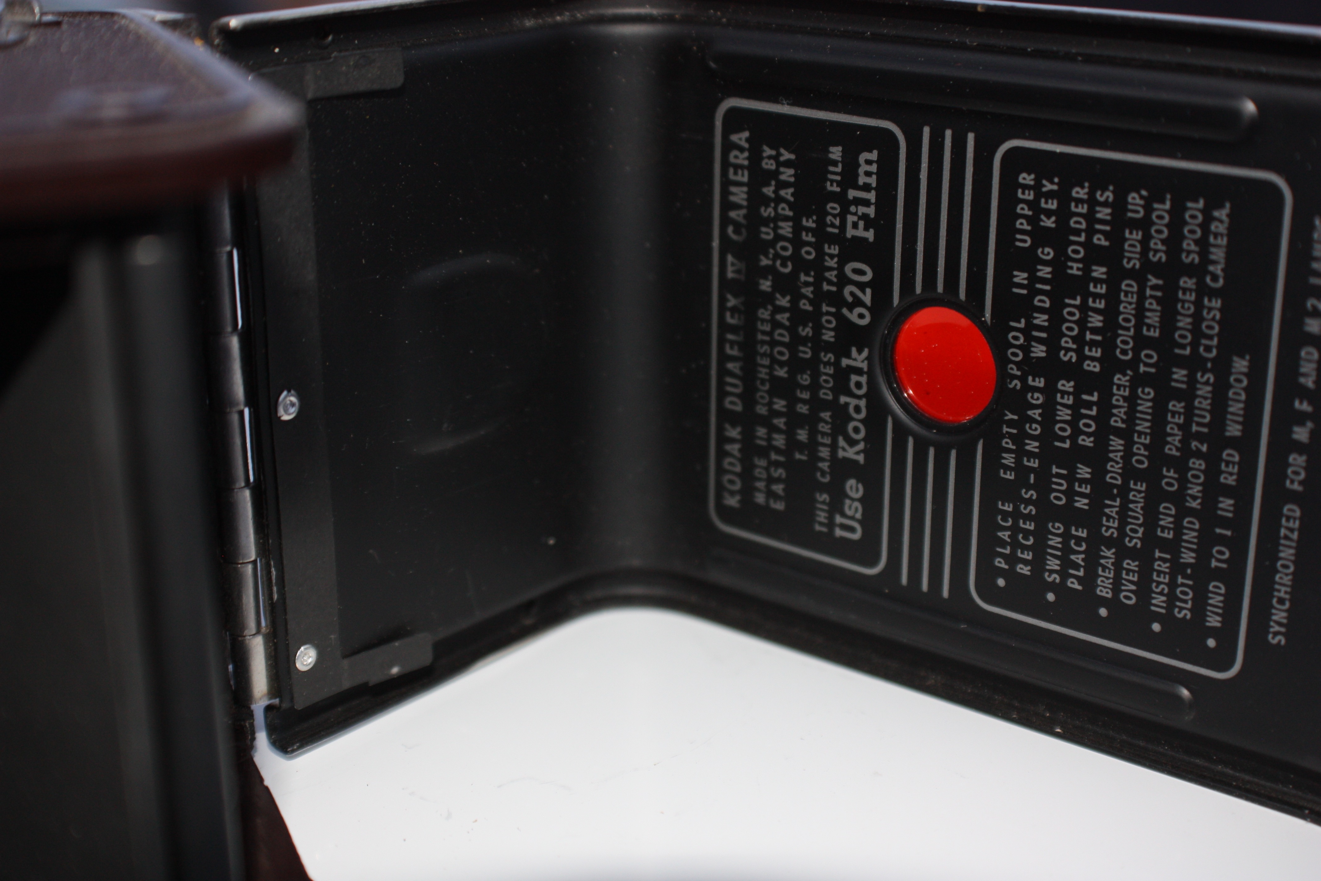
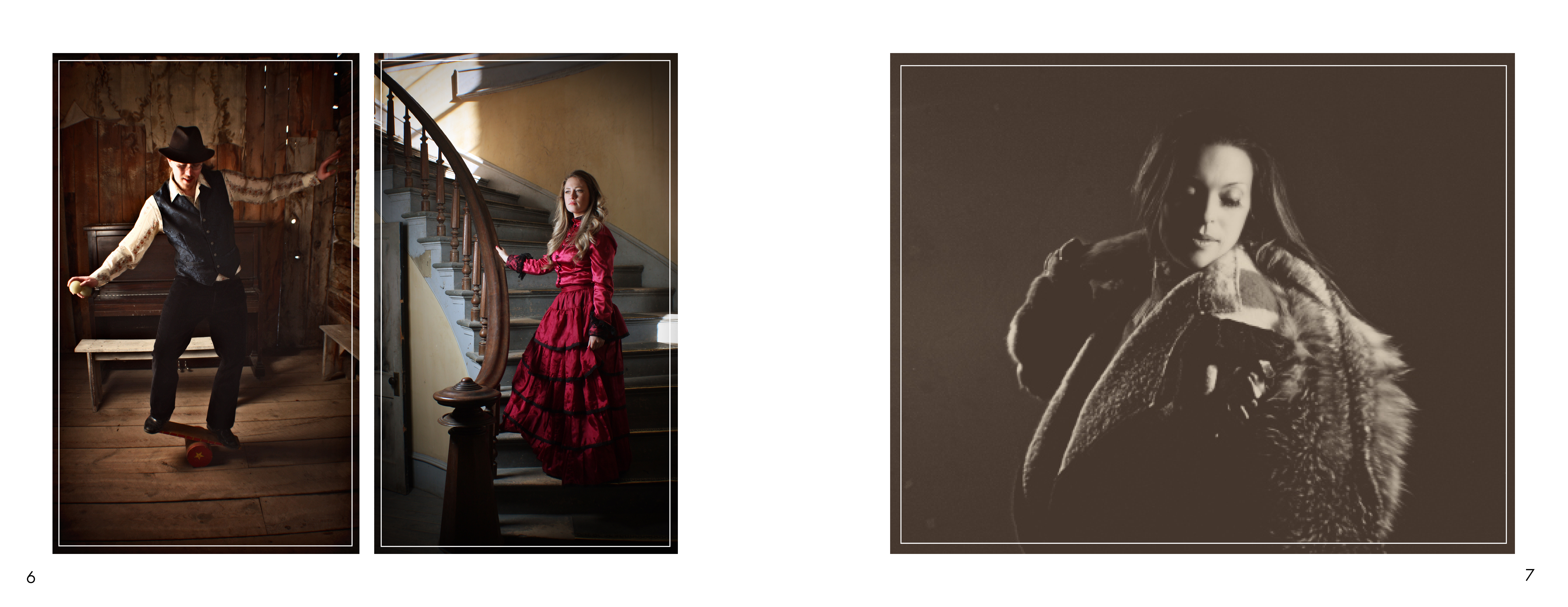
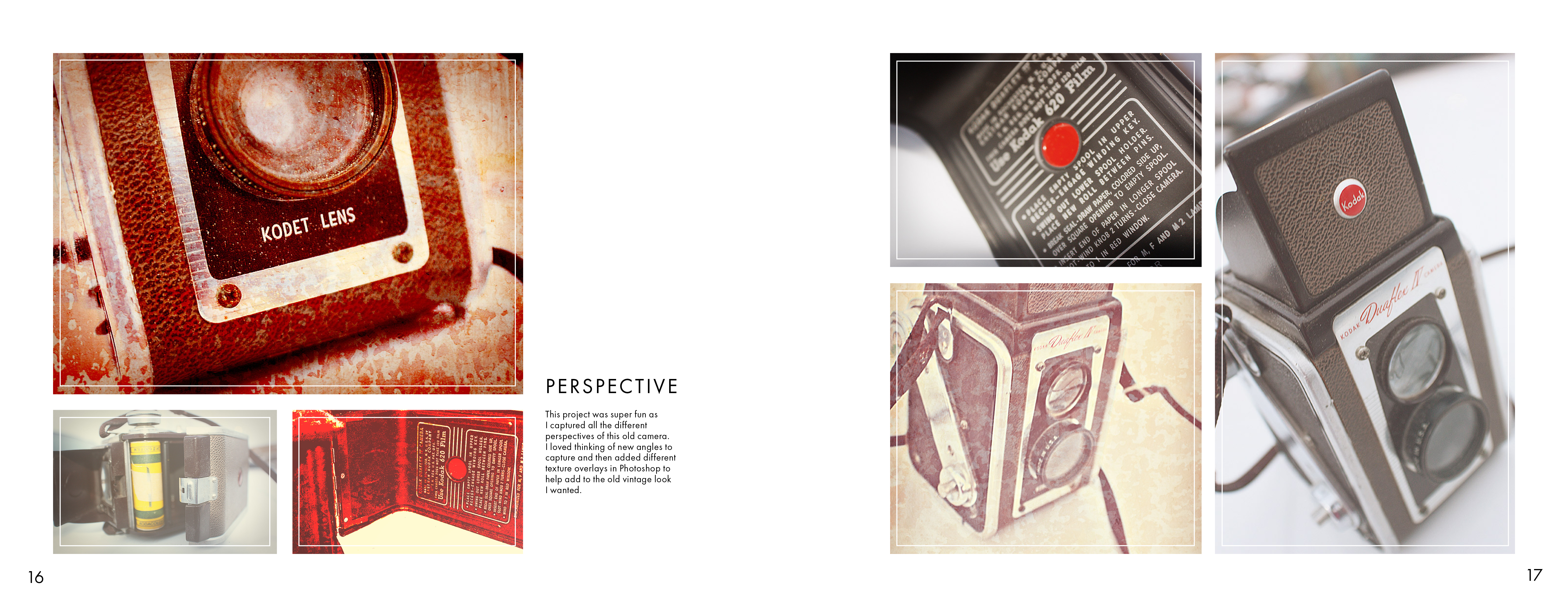
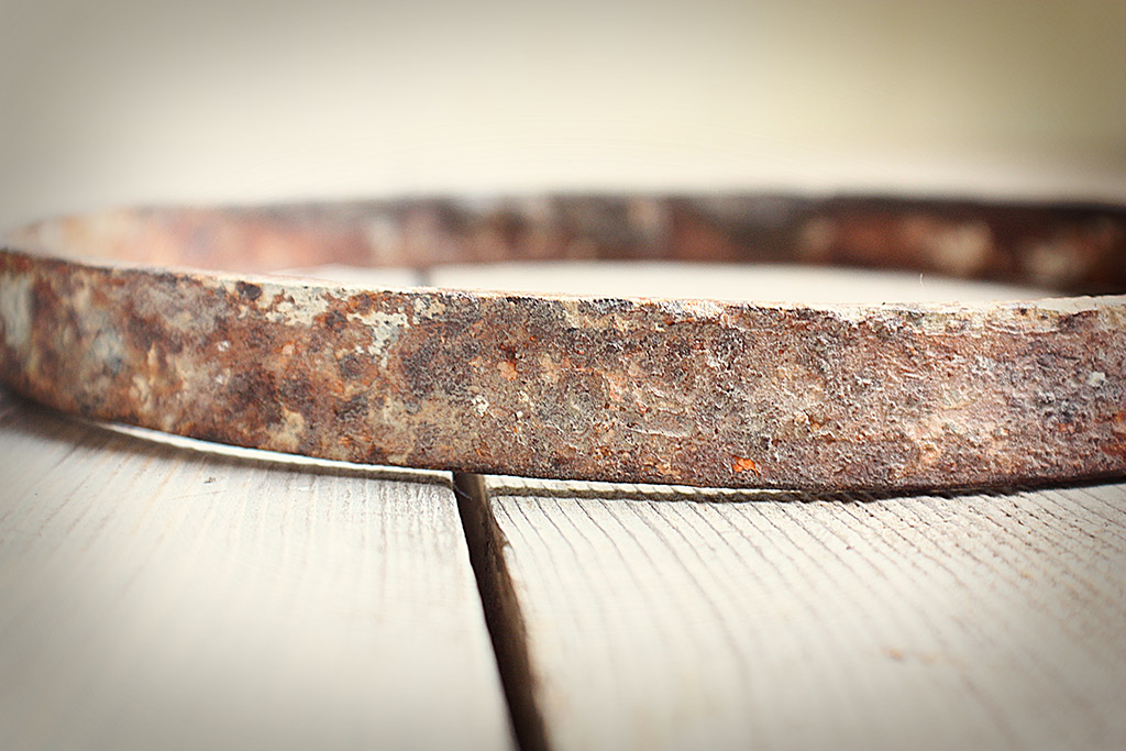
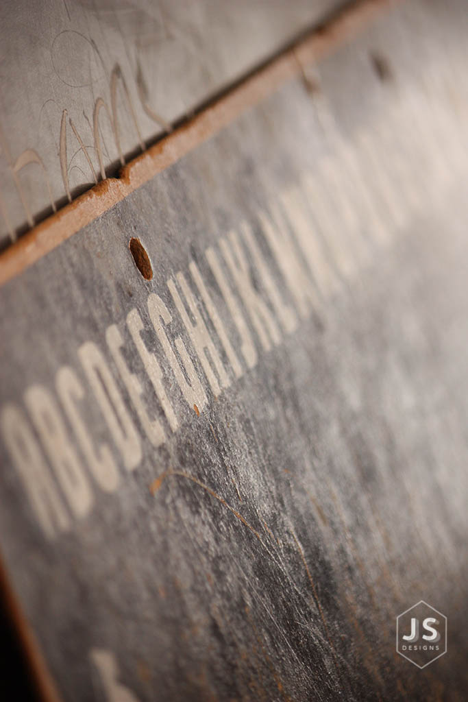
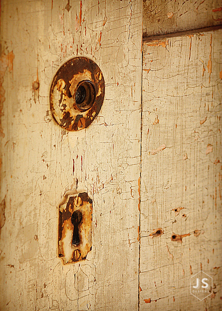
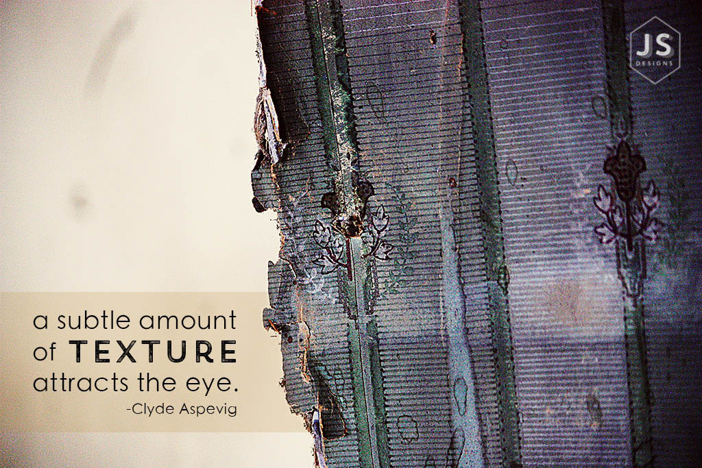
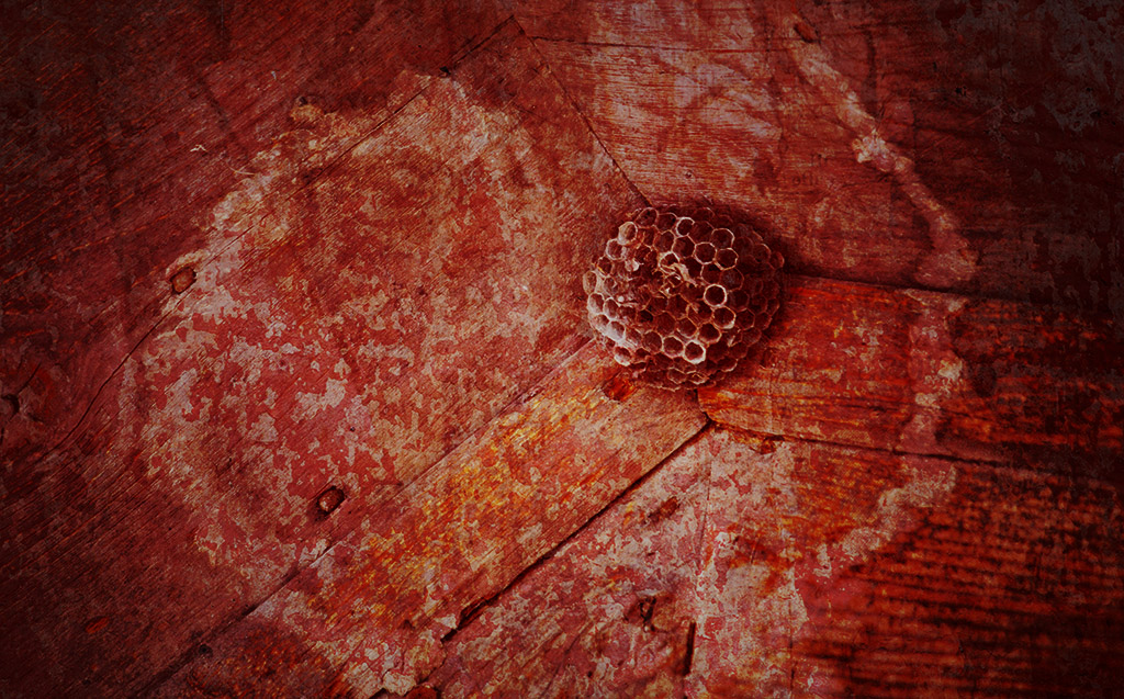
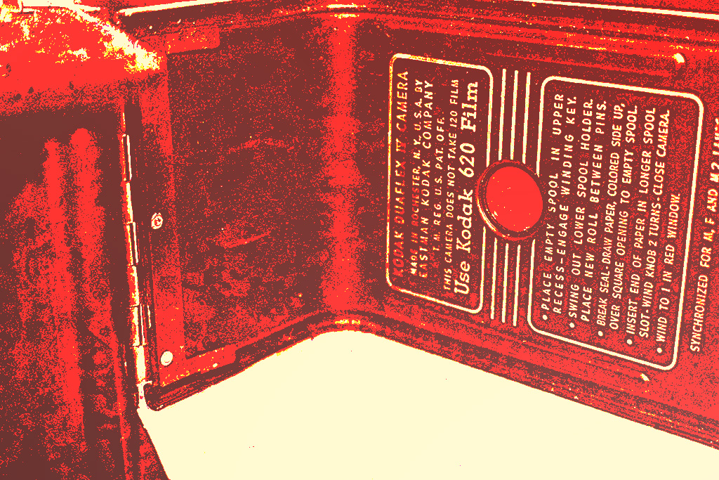
This was the inside of one of my old cameras that I inherited from my grandpa.  I then edited the picture in photoshop and used a textured image to and used the color overlay option when blending it.

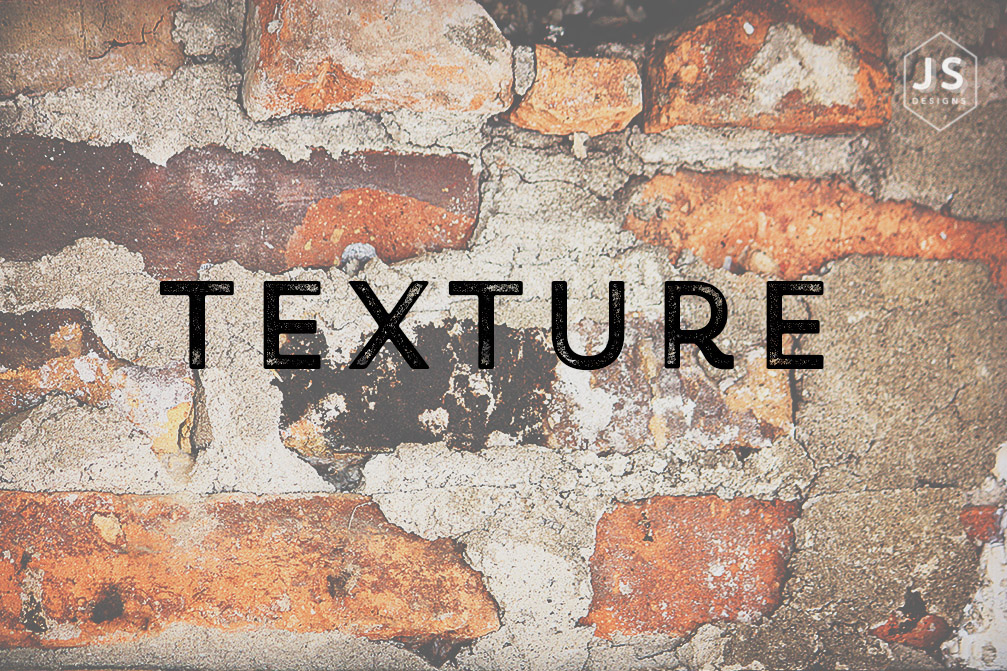
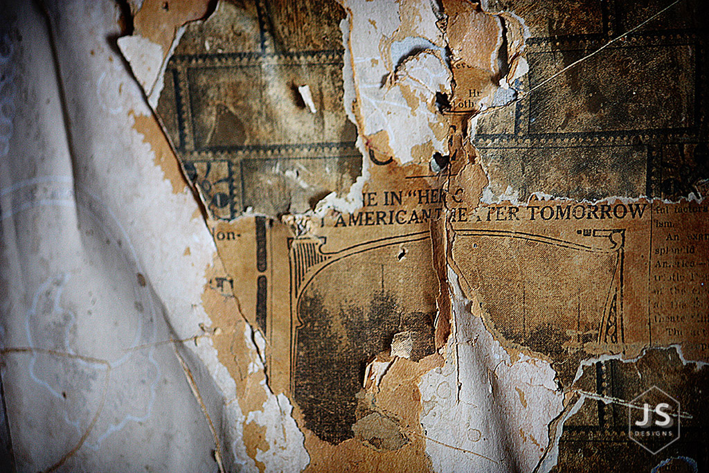
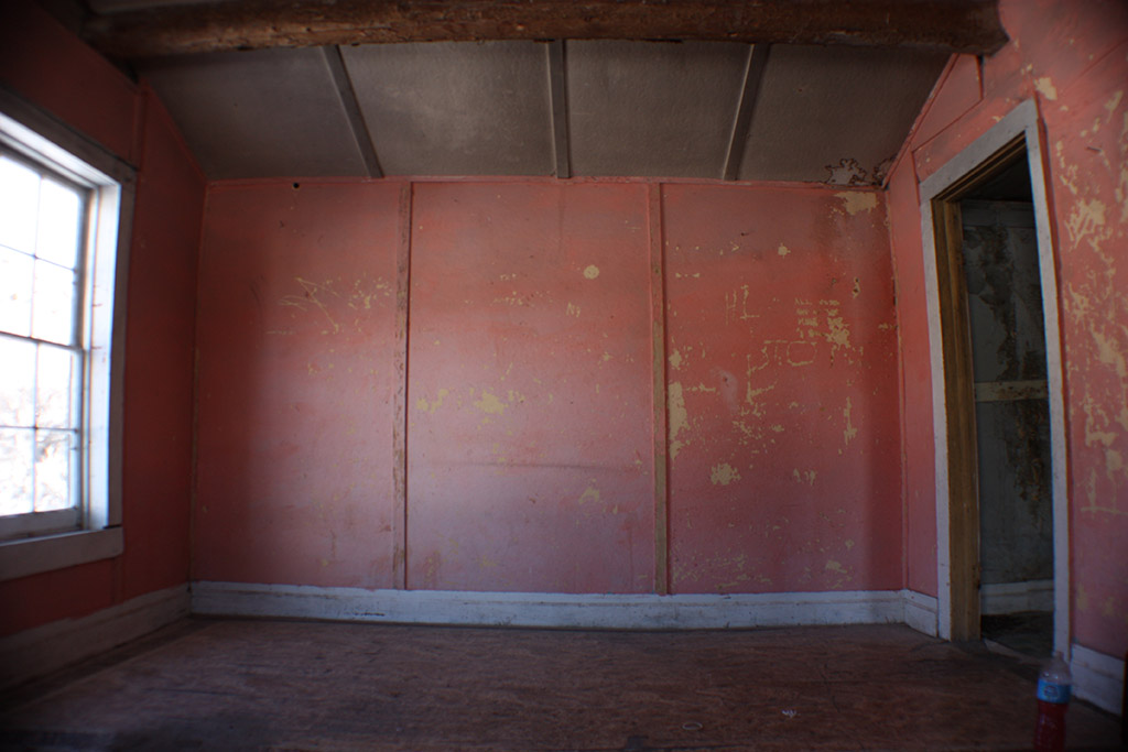
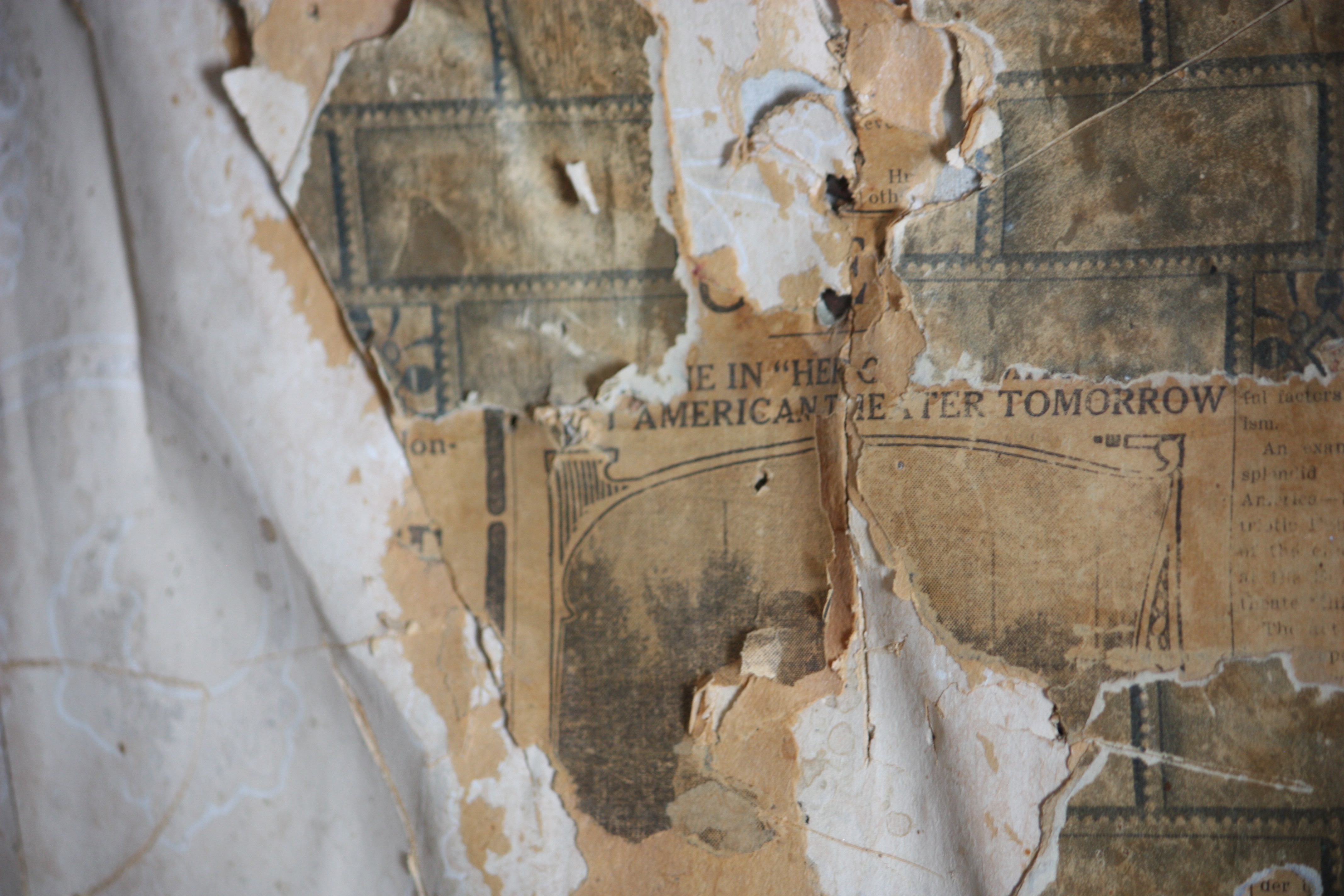
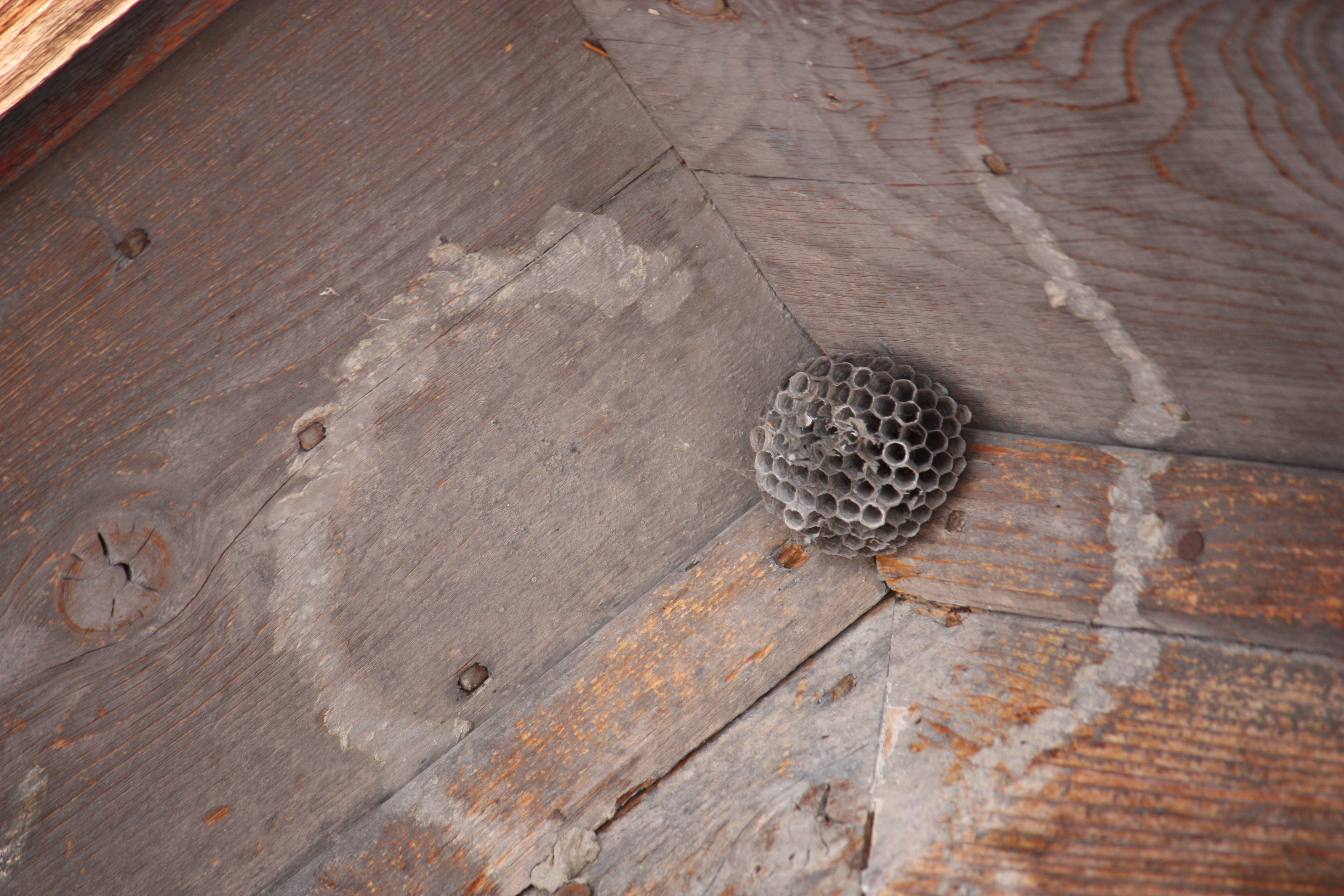
This is the original image and the texture overlay image.

IMG_5138

PlasterColoured0313_3_M

Photobook Final

I had a lot of fun through out this semester learning more about my camera and and the adobe programs used to edit images.  I loved the opportunity that we had to go to the ghost town in Montana and work on our skills some more and work with models and auxiliary lighting equipment.  This photobook displays some work that I have done this semester and a few from previous times.

I loved designing this book and making it my own.  I will cherish this book and the experiences that I learned this semester forever.  I really feel that this book is a great representation of my skills I learned this semester in the Comm 300 class on campus at BYU-Idaho. Please enjoy my book below by clicking on the picture or the link.


JaleneStradlingfront-COVERS

This is a link to my Photo book

Fine Art Print

JaleneStradlingFineArtAfter

For this project, I was able to travel to Bannack Ghost town in Montana.  This trip was a lot of fun and taught me a lot of new tips and tricks when using my camera.  During our personal free time I liked looking at the small little details in things around the town and in the buildings.  This shot was taken in the old church building that had rows and rows of beautiful old chairs.  I found this row near a window and took this image.  I love the repetition of the arms of the chairs and the tiny details of the company name.

Once I got home and started editing, I remembered taking this picture and love how it turned out straight of the camera, but also wanted to emphasize the color and grain of the wood.  I first sharpened the image to help emphasize the single arm of the chair, then I added some warm colors with an action in photoshop to warm up the whole image and add some natural looking color to the chairs.  Finally I added a soft vignette around the whole image to add some interest to the photo.  I love how it all turned out and especially love the large format print of this image.  It is something that I will proudly display in my home for years.

Here is the before and after of the image.

JaleneStradlingFineArtBefore JaleneStradlingFineArtAfter

Photobook

I am so proud of how this whole photo book came together.  I had a lot of fun this semester taking these pictures and adding in some past photos as well so I can take this book with me to interviews and showcase my abilities as a photographer and designer.  I hope you all enjoy this book as much as I enjoyed photographing and designing it.

JaleneStradlingPHOTOBOOK-COVERS2

JaleneStradlingPHOTOBOOKFINAL

JaleneStradlingPHOTOBOOKFINAL2 JaleneStradlingPHOTOBOOKFINAL3 JaleneStradlingPHOTOBOOKFINAL4 JaleneStradlingPHOTOBOOKFINAL5 JaleneStradlingPHOTOBOOKFINAL6 JaleneStradlingPHOTOBOOKFINAL7 JaleneStradlingPHOTOBOOKFINAL8 JaleneStradlingPHOTOBOOKFINAL9 JaleneStradlingPHOTOBOOKFINAL10JaleneStradlingPHOTOBOOKFINAL11JaleneStradlingPHOTOBOOK-COVERS

Top five images

Here are my favorite images for the Fine Art prints.

The first two images are my absolute favorite.  I hadn’t thought about adding a sepia finish until after I had edited them in color, then just wanted to see how they would look in sepia and black and white.  It turned out that I LOVED the sepia finish the most and think that it helps emphasize the light on the models in the images.JaleneStradlingPortraitAnnellaJoSepia-blog JaleneStradlingCowboySepia-blog

JaleneStradlingFineArtBlog-Pews JaleneStradlingMagician-blog JaleneStradling-FineArt-Blog-Ring

Blog 9 First spread, TOC, Covers, Professional Page

This week I created a few pages for my photobook design.  I used Adobe InDesign to create the way I wanted the covers, table of contents, contact page and one of the spreads to my book.  I also created a logo and repeating theme with Adobe Illustrator and InDesign.  I love how it all turned out so far and can’t wait to finish the book.  I went with a very simple modern look.

Front Cover

JaleneStradlingPhotobookPages5

Back Cover

JaleneStradlingPhotobookPages

Table of Contents

JaleneStradlingPhotobookPages7

Contact

JaleneStradlingPhotobookPages6

First Spread

JaleneStradlingPhotobookSpreads2

JaleneStradlingPhotobookPages2

JaleneStradlingPhotobookPages3

Activity 8: Tasteful Typography

JaleneStradling-DesignTemplate

JaleneStradling-BrickTexture1

JaleneStradling-ChalkTexture JaleneStradling-DoorTexture1 JaleneStradling-Metal-WoodTexture

JaleneStradling-TexturePhotography-Wood JaleneStradling-TextureDoor JaleneStradling-PaperTexture JaleneStradling-MetalTexture

JaleneStradling-WallPaperTexture JaleneStradling-WallPaperTextureQuote

For this activity we traveled to a remote ghost town in Montana called Bannack Ghost town.  The town itself was full of rich history and lots of awesome textures all over.  I really love textures and have come to love overlaying textures in my everyday photography.  I wanted to capture the different textures of the buildings we were able to explore.  I then edited them in photoshop to accentuate the textures I captured.  Finally I added some tasteful typography to a few images that describe my theme for this project.

Fonts used:

Title: Trend RH Sans One, Decorative Sans-Serif

Body: Heiti SC Light, Sans-Serif

Master Pages in InDesign

Hey everyone, I made a quick tutorial about how to use Master Pages in Indesign.  Master pages are super helpful to quickly set up repeating elements in a document or book such as page numbers, background colors/images, logos, headers and footers.  This would be a really great feature to use when creating the photo-books because you can set up certain layouts and apply them to certain pages within your design.

JaleneStradingIndesign Master Pages

Watch this quick tutorial on how to why you would use Master Pages and how to set them up in InDesign.


Here is a link to my power point

JaleneStradlingIndesignPowerPoint

JaleneStradlingInDesignPowerPoint  (Pdf version)


This video was super helpful in helping me set up Master Pages in Indesign.

CREATIVE

These shots are all my creative images from our trip to Bannack.  The first is a levitation image that combines 2 photos to make a subject floating in the air for the final image.  The next photos are creative and abstract images that I found while exploring the town of Bannack.

  1. Levitation

JaleneStradling-Levitation

JaleneStradling-Levitation-1JaleneStradling-Levitation-Background

2. Out of the Box

JaleneStradling-OutoftheBox

3. Abstract Texture and color:  I explored with adding some color and texture overlays to the original image.

JaleneStradling-Abstract

PlasterColoured0313_3_MIMG_9974IMG_9955

4. Color overlay: I added a textured colored image to achieve this image.

JaleneStradling-Abstract-Color

PlasterColoured0313_3_MIMG_0043